The hidden truth behind Ancel Keys’ famous fat graph
For a while, in the middle of the last century, there was a scientific struggle. Was fat or sugar to blame for cardiovascular disease? Ancel Keys was the champion of the first theory; Professor John Yudkin of the other. Keys won, but not all of the data he used to make his arguments was a fair representation of reality.
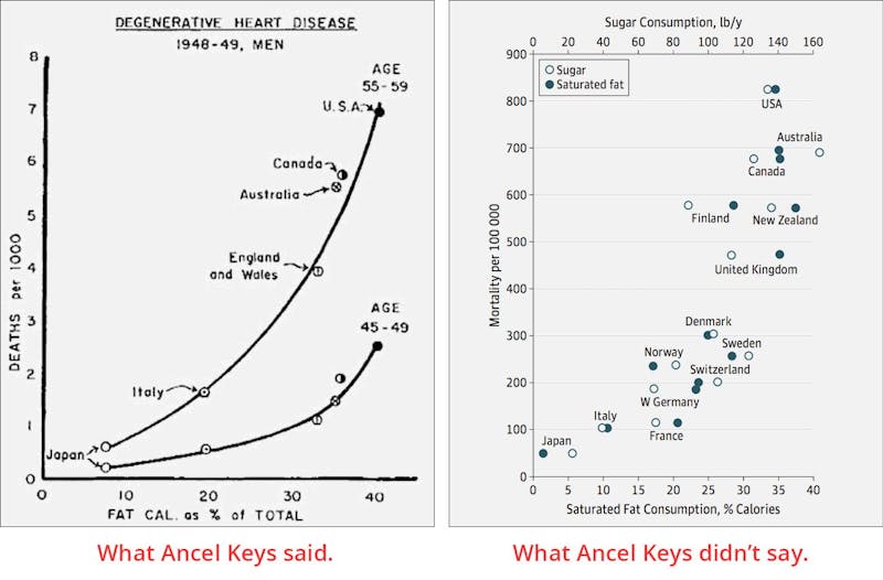
The left graph above was famously used sixty years ago by Keys, to support his idea that fat intake was responsible for heart disease. But as the right graph shows, the same data could just as easily have implicated sugar. Countries eating higher amounts of fat were simultaneously eating more sugar. It was just a question of what you were looking for.
Since that time, we’ve spent half a century fearing natural fat, and instead eating more carbs. At the same time, an epidemic of obesity and diabetes has occurred. Even though the association in the graph on the right can’t show cause-and-effect anymore than the graph on the left, it may be time to reconsider: maybe Yudkin was right.
Earlier
NYT: How the Sugar Industry Shifted Blame to Fat
More
Top videos about sugar
- MEMBERS ONLY
![Is sugar toxic?]()
- MEMBERS ONLY
![The problem with sugar]()
- MEMBERS ONLY
![Are all carbohydrates equally bad?]()
- MEMBERS ONLY
![Q&A about low carb and sugar]()